IoT monitoring dashboard for sensor based IoT data visualization is a smart way to showcase remote data online in the form of graphs/charts and other visuals so that it becomes easy to understand and can be compared with historical data. In the same way, IoT visualization works.
Data Analysis and Visualization in IoT dashboard
An IoT dashboard ,also be referred to as an IoT web app or an IoT control panel or an IoT data visualization tool as its primary purpose is to collect data from different smart devices in real time and convert it into human-readable information. There are various IoT cloud platforms, which offer many features, from fetching and storage of data to analyze.
Let’s understand sensor data visualization in IoT dashboard along with other IoT control panel elements in detail.
Key Components for IoT Data Visualization
IoT Dashboard is a web or mobile application that is used to control smart sensor devices along with displaying the data generated by these sensor devices. These real time IoT dashboards not only helps in understand the data , but also help in managing these devices,
Along with data representation and visualization in IoT, a well designed and developed IoT device control panel requires the following elements:
- Real-time data collection
- Data representation
- Analysis of IoT sensor data
- Data management
- Sensor Data Visualization
- Storage of IoT sensor data
- Managing IoT devices
- Keeping the devices online
- Security of generated data
1). Real-Time Data Collection
The main objective of IoT dashboard data analysis is to provide real-time and historical sensor data visualization in the form of an IoT data chart. Imagine if an IoT dashboard providing a weather forecast is giving the correct information, but after the weather conditions change. The data collected is of no use after the time of occurrence passes. With real-time IoT data collection, businesses can monitor operations live, detect anomalies early, and make faster, data-driven decisions.
Therefore, a dashboard must display both historical as well as real-time data.
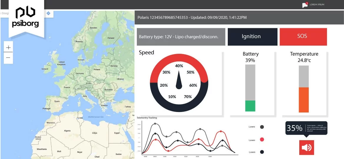
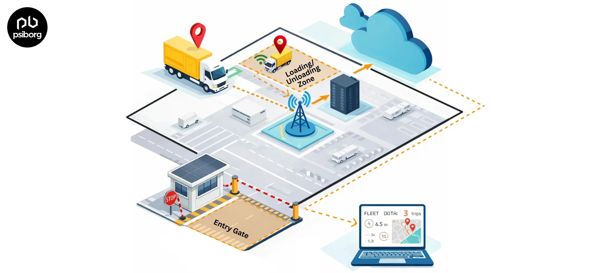
Real-time data is referred to as information displayed on the IoT web app screen with low latency. The image shows the screen of a Vehicle tracking and monitoring system centralised dashboard displaying the live location through GPS tracking.
2). Data Representation in an IoT Dashboard
We are living in a technological era where everything is connected with each other via the Internet. However, the Internet is packed with data files, including images, text, statistics, etc. The question that arises here is which data is important and which data is trash. This is done by analyzing data and categorizing it as information and data. In simple terms, we can say that remote IoT data analytics and visualization is the process of analyzing raw data and extracting useful information from it.
IoT devices are developed using sensors, and there are different sensors for different parameters. For instance, a proximity sensor will sense the distance between two objects, and a temperature sensor will sense the level of heat or cold in the surroundings to detect temperature. All this data is stored in the cloud storage of the device. The IoT control panel analyses the essential data and transmits it to data visuals or IoT data charts.
3). Analysis of IoT sensor Data
We are aware of IoT analysis now, but how does it work? The flow of IoT analysis is easy to understand with the flow diagram below:
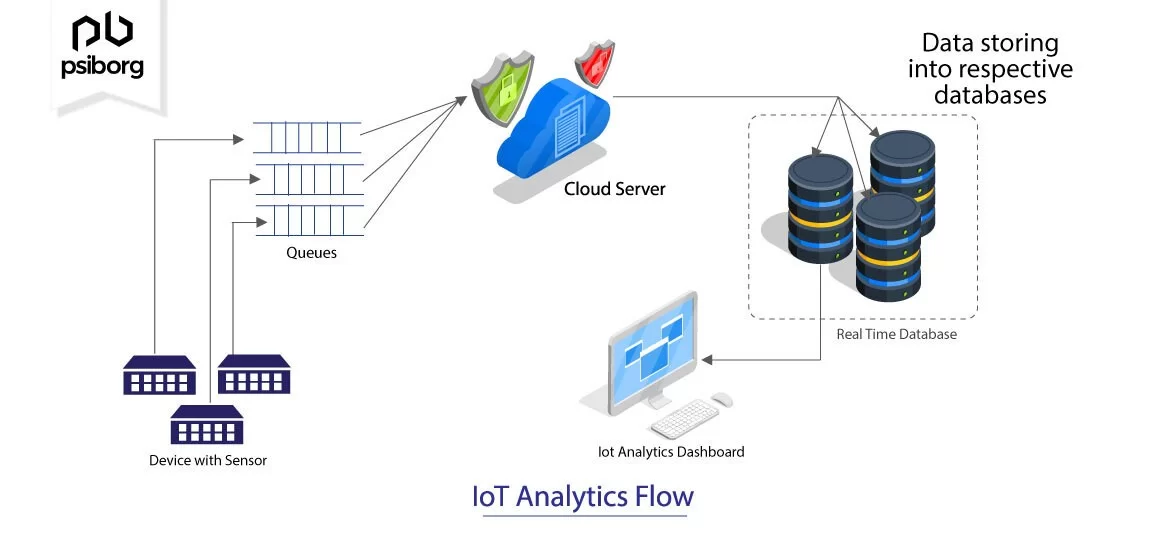
IoT sensors installed on assets or environments continuously capture real-time data such as temperature, location, movement, or equipment status. This sensor data is transmitted to the cloud server. The stored data is analysed on backend , and displayed on IoT dashboard for user understanding and Actionable insights.
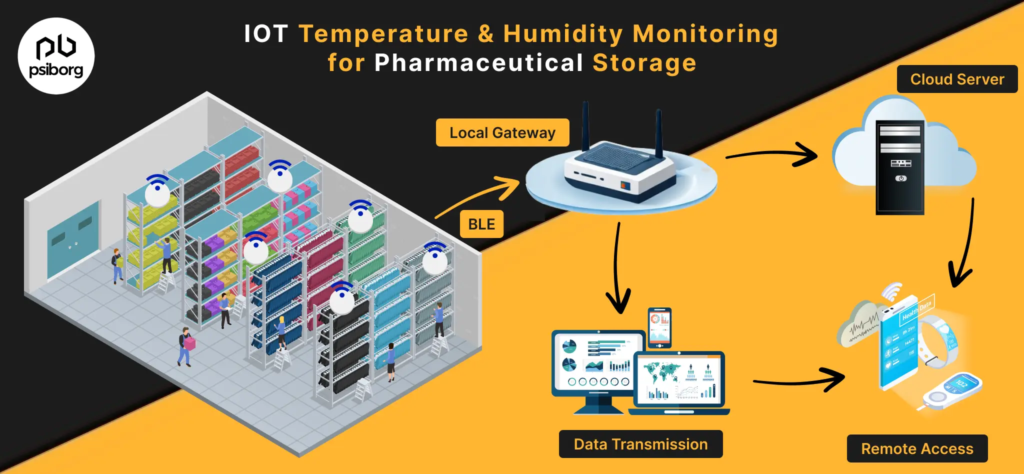
By now, a question arises how does sensor data go from device to cloud?
IoT Gateway devices sit at the intersection of the cloud and IoT device nodes or sensor devices. IoT gateway sends edge-computed data to the cloud for further analysis and storage. The data collected from wireless sensor networks or other IoT devices will be transmitted through gateways to the cloud. The received data is then stored in the cloud. IoT data analytics continuously analyzes the data and sorts it by putting it into respective databases. The IoT analysis dashboard monitor IoT data from the database and starts making visuals.
4). Data Management in IoT Web App
Data management or organization is another element of a successful IoT dashboard. A dashboard is entirely functional to synchronize data from the database created in the cloud and convert it into human-readable visuals. But how will the user understand which data is relevant and which is not? Here comes the part which is played by the data organization functionality. An IoT control panel should be able to sort data according to the parameters and values set by thresholds and other configuration settings. The user should be able to emphasize, resize, or export the data displayed on the web app according to his requirements.
Emphasizing the data refers to highlighting the essential data from a bunch of unimportant data. Let’s say if there is some critical situation that needs user attention immediately, but the dashboard is displaying the information in the usual way, then it might cause severe damage. Therefore, it is important to emphasize the data. .
The screen shown is a representation of an IoT dashboard for a soil quality monitor where the user can click on the particular dot on the land map to check the values of that specific sensor device in a zoomed screen.
5). Sensor Data Visualization in an IoT dashboard
Data visualization is a term used to describe two most essential feature of an IoT Dashboard, that is, IoT sensor data collection and sensor data monitoring. An image is much more precise than words. This means that we grab the concept better if it is visually appealing rather than textual information. In simple words, data visualization is the art of visualizing information in the form of visuals such as graphs, pictograms, bar charts, pie charts, etc. There are various IoT data visualization tools integrated with the dashboard which maps the data in pictorial formats. Now, let’s understand how data visualization is useful in the IoT Dashboard.
The IoT dashboard is a medium to represent the data collected by the IoT device. However, the data collected is vast in numbers. Therefore, all the data collected must be shown in visuals so that it can be easily understandable by the user. In other words, IoT data visualization is a way of presenting the raw data in a more coherent form.
To conclude everything, data visualization understands the large amount of data collected by different sensors and transmits the data into meaningful visuals.
IoT data visualization techniques
Different techniques and tools are used to create these remote IoT cloud charts and data visuals. Below are some of the data visualization types-
- Graphs
- Histograms
- Pictogram
- Bar graph
- Heat Maps
- Gauges
- Statistics
- Line graphs
PARAMETERS REPRESENTED BY DATA VISUALISATION
IoT dashboards display the data collected by the sensors integrated into an IoT device. The following parameters can be visualized in an IoT Dashboard.
- Weather conditions
- Soil Conditions
- Location
- Chemical level
- Current or voltage
- Temperature and Humidity
6). Storage of IoT Sensor Data
An IoT device generates tons of data every second. Let’s say if a device is being used for getting weather information in real-time, then it will generate data for every change which is happening in the environment and this will constitute a lot of data over a period of time.
Smart devices are designed by integrating sensors that cannot store this amount of data. Therefore, all this data is stored in cloud storage.
The IoT Dashboard is said to be useful only if it can load data efficiently and create visuals from the database.

The above-displayed dashboard is associated with a soil quality monitor, displaying a history of moisture level so that whenever the moisture level increases or decreases, it can visualize the values from the device database.
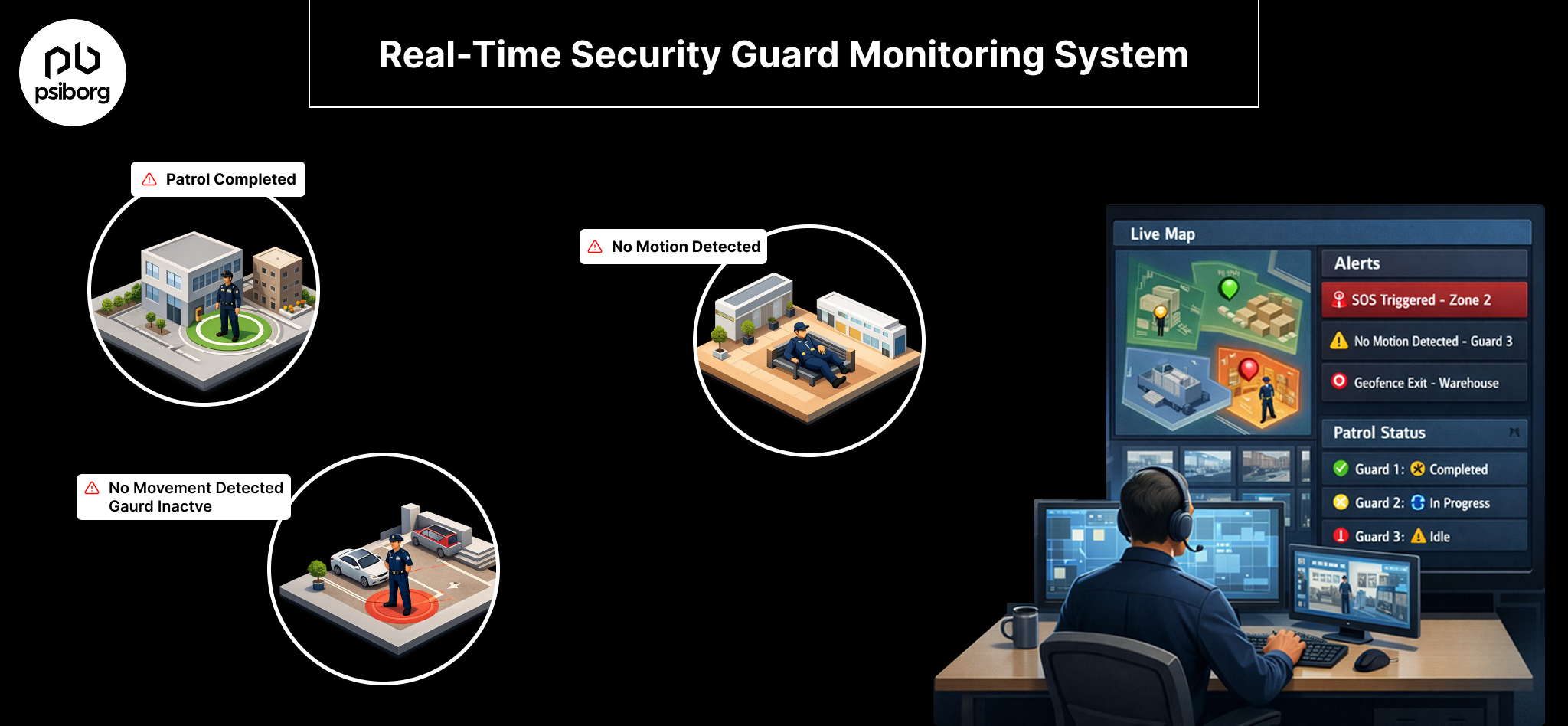
7). Managing and Keeping IoT devices secured
One of the key roles of IoT dashboards is to manage devices , user Roles and deployed sites. IoT Admin Dashboards does this very role , which lets the admin assign different users to view the specified site data. So that , a hierarchy in data access can be followed.
Use Cases of IoT Data Visualization Across industries
The above information is useful for building a successful IoT dashboard. Let’s understand more by the real-life examples of such IoT web apps.
1). Electricity Consumption Monitoring Dashboard
Electricity consumption monitoring can be installed in factories, multistorey buildings, or offices to know each floor’s power consumption. The dashboard will show power failure, short-circuit, wiring issues, etc. In real-time. The system saves time and damage caused by power cuts in factories or buildings where every operation is dependent on machinery.
2). Dashboard for Manpower Productivity Analysis
An manpower tracking and management dashboard is useful in making successful predictions. The production graph of the company’s different departments can be displayed on the dashboard, which can be used to predict the measures to increase the departments’ productivity. This can help with business growth as well as in increasing revenue.
The labor productivity tracking market—which relies heavily on IoT-based tracking dashboards—was valued at US $8.07 billion in 2025 and is projected to grow at a 13.8% CAGR through 2032. This massive growth underpins the growing enterprise reliance on IoT dashboards for workforce efficiency. Source- Coherent marketinsights
3). Manage Parking spots with sensors and Dashboard
An IoT-based car parking management system sends real-time information in visuals and Graphics. The vacant space shows a green signal, whereas the occupied parking space displays a car icon. The IoT control panel for smart parking displays the car plate number so that users can quickly locate the car and save time.
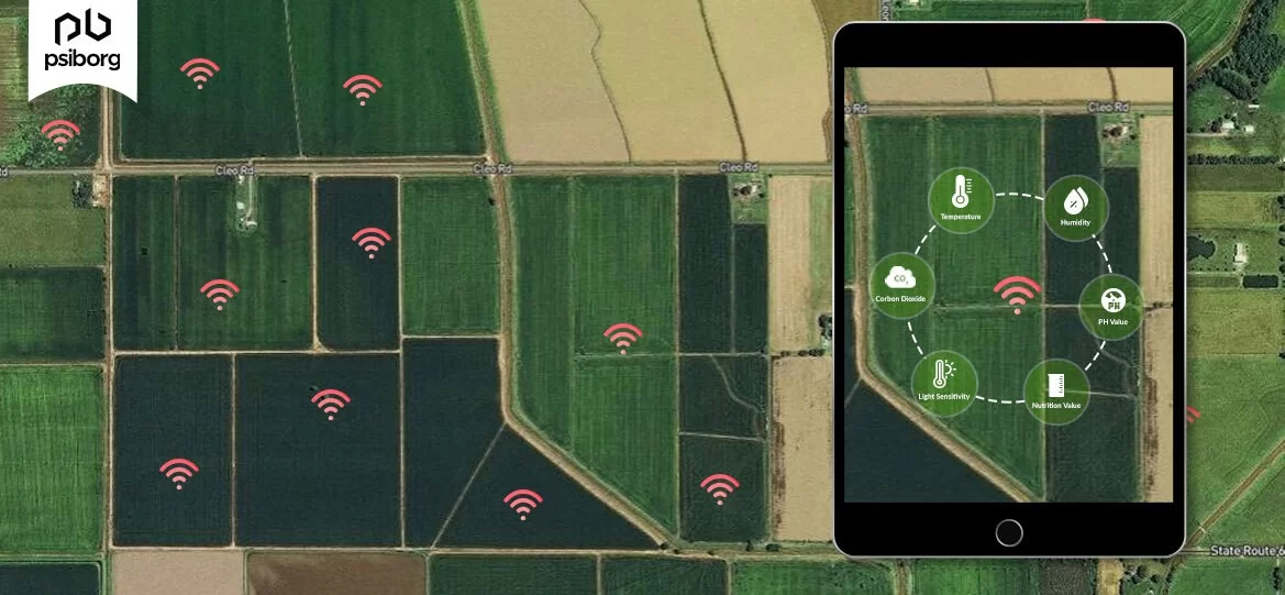
4). Soil Health Monitoring Dashboard
The amount of nutrients in the soil is crucial for crop health. The Soil Monitoring dashboard lets you know the deficient nutrients and also informs about the moisture in the Soil. It not just monitors , but help in turning on water valve remotely.
5). Environmental Monitoring
The Environmental monitoring is not a short period of monitoring but one that extends over months, years, and even a lifetime sometimes. IoT-based Environmental Monitoring involves monitoring Air quality, Water quality, Landslide detection, Forest fire, etc.
6). Cattle health and Location Monitoring
Cattle Monitoring using IoT helps farmers to keep track of their cattle in real time. It helps in combating many problems faced in the livestock industry. With the help of the IoT Dashboard associated with the tracking device, farmers can create virtual boundaries with geofencing to secure the locations where the livestock can move freely.
Conclusion – Turning IoT data into Decisions through IoT dashboards
An IoT dashboard is not just a visual representation — it acts as the intelligence layer that converts raw sensor data into real-time, actionable insights. With data collection, processing, and visualization, it empowers businesses to monitor operations, respond faster, and make informed decisions. From asset monitoring and environment sensing to workforce tracking, an effectively built IoT dashboard simplifies complex data and brings visibility across processes.
A little About what we do at PsiBorg,
PsiBorg is the leading IoT development company, where we have developed many IoT systems and Customized IoT Mobile Apps .If you are looking for a perfect partner for designing and developing your IoT ideas, we can be your best match.
FAQs
It’s actually a graphical representation of all the data that has been collected from different IoT devices. The core idea is to make the data much easier to understand. Basically, it includes various charts, graphs and dashboards for displaying real-time or historical trends in a simpler way. That’s how users can monitor, analyze and make informed decisions in less time.
We need IoT Data Visualization for converting raw and complex sensor data into much simplified, actionable insights. Users can get a better idea of the situation and hence make a lot better decisions. In fact, visualization tools also help detect abnormalities and improve the overall efficiency of IoT systems.
Yes, PsiBorg provides industry-specific IoT Data Visualization solutions. Our dashboards provide real-time data monitoring, visual elements and analytics features with which businesses can manage IoT devices more effectively and also gain valuable insights.
It’s a user interface where real-time data from connected devices is displayed in real time. It makes use of IoT Data Visualization to present required metrics, alerts and trends in the form of graphs, charts and widgets. Through dashboards, users can track system performance and respond to events fast.
When we say “real-time data analysis in IoT”, it means continuous collection, processing, and displaying of device data. Using IoT Data Visualization tools, users can monitor trends, receive alerts, and identify issues as they are happening. As a result, the responses become quicker and operational efficiency is improved.